Top 4 Colours to Use in Packaging Designs
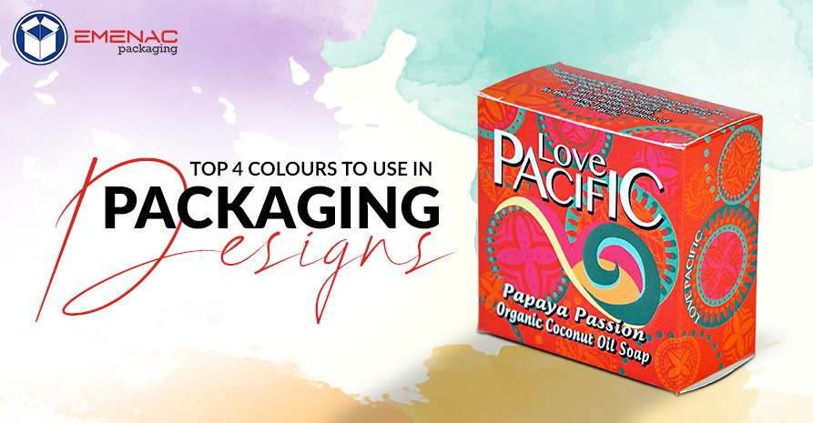
Do you know the pink colour was known to donate masculine power and blue was the colour of women, just about a century ago? Now, this has changed. The culture of societies is evolving with this colour preferences holds a unique and pivotal value in custom packaging and the marketing world. Impacting deeply how your brand is perceived, holding sentimental value in influencing the minds of shoppers.
For some company’s colour is a mode of communication. While others think it is just a minor factor. Shades can penetrate deep into the subconscious of people and embed your message. Right colour selection in custom printed packaging can lead to amazing results! A wrong hue can have a bad impact on your business.
Colour psychology can have a huge impact on your packaging boxes even more than you think. So, how do you know which shade is perfect for your brand? Well, here is the list of four colours that have proven track records of sales.
1. Red:
Red is more than a colour it invokes a strong physical and emotional response among people. If used correctly, red can speed up the heartbeat, and attract the focus of shoppers. Deemed as the popular colour in packaging and sales. It is perfect for food custom packaging, as it increases appetite and raises the metabolism rate. A common example is McDonald, KFC and in the entertainment industry, Netflix uses red to appeal to people.
2. Green:
Green donates nature, body and emotions. In packaging boxes, green is the colour that is used for environmentally friendly products and organic materials. It signifies wealth, harmony and balance. It is one word that says it all about the environment. Due to the outdoorsy and organic nature, it has huge appeal among buyers that prefer the eco-friendly product. Too much green can bore and push people away from you.
3. Blue:
Blue creates a bond of trust, loyalty and friendship among the shoppers and brand. Many airlines use this shade to enhance their trustworthiness. Using it in your packaging designs will make people trust you.
The majority of well-known companies are using blue in their logos and designs. A famous example includes Twitter, Facebook etc. Blue is a tranquil hue. People often find it more relaxing.
4. Orange:
Orange is energetic, uplifting and mood changing shade. It cheers up the gloomy people. It has huge appeal in the advertising and marketing world. Using it in packaging along with different other shades can influence the decision of people in your favour. Using dark orange shades can instantly increase the visibility of your product. Orange shade also has a supernatural effect on people.
Which Colour Should You Use?
The answer to this question depends upon the age and gender of the people you wish to target. If kids are your target audience, then don’t go for red. Similarly, for adult’s purple or anything close to red will grab the focus of people. For Eco-friendly clients, shade preference should be green. Colours can empower your brand, bring freshness and differentiate your brand. There are other elements as well which includes texture, design, and material of the box.
Share This
