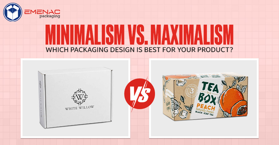
Minimalism vs. Maximalism: Which Packaging Design Is Best for Your Product?

Maximalism and minimalism both are frequently used packaging designs in the packaging industry. These designs incredibly provide a unique, aesthetic, and beautiful look to your custom-printed boxes. You might be attracted toward one or the other (or maybe both). But, if you are not aware of which one suits your business, then read this blog and unveil the differences between minimalism packaging and maximalism packaging designs:
What Is Minimalist Packaging?
Minimalist packaging is related to a design that provides an aesthetic feel and follows a “less is more” perception. Its goal is to provide a simple but attractive and unique look to custom packaging boxes that influence the customers toward products. You can provide a minimalist look to your products by using symmetry, earth tones, and clean lines. This is how you can provide a minimalist look to your custom boxes.
Minimalist Fonts and Typefaces for Design
When it comes to minimalist typefaces and fonts, the two most important things are visual, and legibility impact. It means that the letters on the custom-printed boxes must be prominent and clear to read.
Top 5 Minimalist Style Fonts Used on Custom Printed Boxes:
There are plenty of packaging styles and typefaces used in the packaging industry. Here are the top 5 minimal font styles that can be used on custom-printed boxes:
- Panton by Font Fabric
- Prime by Max Pirsky
- Gidole by Andreas Larsen
- Hero by Front fabric
- Uni Sans by Svet Simov, Vasil Stanev and Ani Petrova
Minimalist Color Palette Ideas:
Ready to create a minimalist packaging design but confused about how to use all vibrant and neutral colours together? Don’t worry, check out these five pristine colours that may provide an outstanding look to your packaging boxes.
1. Cosy Grey Sophistication
- Warm beige with grey undertones
- Deep grey
- Stone grey
- Off-white with grey undertones
- Beige pink with grey undertones
2. White Gold
- Light beige with gold undertones
- Medium beige with light brown and gold undertone
- Medium beige with gold undertone
- Very light off-white
- White with gold undertones
- Medium beige with gold undertone
3. Posh Pink
- Off-white
- Light pink
- Off-white with pink undertones
- Beige with pink undertones
4. Earthy Greens
- White with Grey undertones
- Soft Sage green
- White
- Grey with soft sage undertones
- Soft light yellow with sage undertones
5. Beige and Sage and Blue
- Charcoal Blue
- Light Beige
- Off-white with a sage undertone
- Light blue with sage undertones
- Light beige with sage undertones
What Is Maximalist Packaging?
Maximalism is all about being loud, big, vibrant, and bold. Usually, this type of design is layered or bold. The maximalist design is related to playful designs, bold and saturated colours, and is geared towards silhouettes.
Maximalist Typefaces and Fonts and for Design
Maximalist typefaces and fonts are amazing and play an important role in grabbing the attention of your customers. But what type of fonts are best for the packaging industry? Well, fonts must be readable as well as eye-catching and intriguing, that provide a decent feel to your customers.
1. Quirky and Clean
Using quirky and clean font might be a great option for your packaging boxes as this font provides a striking and readable look to your packaging boxes. This font style is most used is a maximalist design because of the contrast and unpredictability.
2. Decked Out Decades
Deck out Decades is one of the iconic and frequently used fonts to provide a maximal look to your custom-printed boxes. This font looks like the disco 70s, groovy 60s, new wave 80s, and grunge 90s. These fonts may not be used together but these are the real beauty of maximalism design.
Here are some decade-themed maxima typefaces:
- Gin with Serenity
- BD Retrocentric with Greycliff CF
- Blakely with Gibson
3. Elegance on Elegance
Maximalism is all about design that is all being over the top and provides an amazing look to your custom-printed boxes. So, if you are looking to provide a bold and attractive look to your packaging boxes then these typefaces are for you:
- Dalliance
- Allyson
- Alfresco
Maximalist Color Palette Ideas:
After having a proper idea about the typefaces and fonts, let’s have a discussion about color palettes. So, based on the color collection, there are two categories of color combinations in maximalist design: balanced contrast and visual vibration.
1. Balanced Contrast
Balanced contrast means these colours are easy to read, look simple but attractive, and help you to provide a decent look to your custom-printed boxes:
- Dark blue background, orange font
- Pink background, dark green font
- Light orange background, green font
2. Visual Vibration
If you use two bright colours on packaging boxes, it may create difficulty in reading the text. But if you do it in the right manner then it may provide an amazing look to your custom boxes. here are some colours you can use to provide visual vibration:
- Green font, red background
- Green font, orange background
- Light blue background, orange font
Which Design Is Best for Your Business? Minimalism or Maximalism
Maximalism and minimalism both are attractive and unique packaging designs that help you to provide a futuristic look to your custom boxes. But which design is for you depends on your brand and your audience. Before selecting a design for your custom-printed boxes, answer these questions, What Are Your Brand’s Values? What Message Are You Trying to Send? Who Is Your Target Audience? Because this is all about your target audience. So, by answering these questions you will get your answer about which design is best for your business. And most important thing is you can contact ___________ to fulfil your packaging design needs and solutions
Share This


