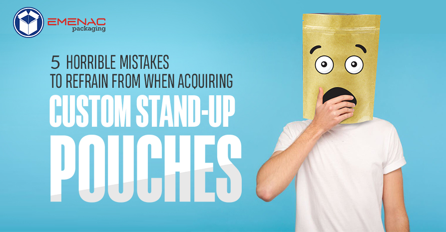
6 Custom Printed Packaging Design Fails And What You Can Learn from Them
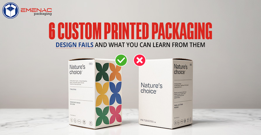
Custom printed packaging is a customer experience and branding behemoth. It has the ability to make your product stand out, create brand identity, and even generate repeat business. But when done poorly, it has the potential to create confusion, frustration, and yes, lost sales.
Below in this blog, we’re giving you six real-life custom printed packaging design failures and some tough-earned lessons you can learn from each to make sure you don’t repeat the same mistake
6 Common Custom Printed Packaging Design Fails
1. Bad Font Selections
The Fail:
A luxury skincare company used an upscale, ultra-thin script typeface on packaging. The design was beautiful on a computer screen, but the text was barely readable in print especially smaller point sizes. Customers couldn’t read vital product information, and returns were the result.
The Lesson:
- Legibility needs to take priority because fancy type is great to look at, but if customers can’t read them, they’re useless.
- Test across sizes to maintain text readable when size is reduced.
- Use hierarchy like most important stuff (product name, main benefit) needs to stand out.
2. Misleading Imagery
The Fail:
A food manufacturer put bright, high-quality images of fresh fruit on the packaging. When opened, though, the product contained was unappealing and processed. The discrepancy between product and packaging created criticism and distrust.
The Lesson:
- Be honest with imagery because customers desire packaging to reflect the product.
- Use realistic photography if your product is not perfect and smooth, do not over-edit photos.
- Consider transparency because windowed packaging or realistic art can build trust.
3. Overcomplicated Design
The Fail:
A technology company introduced a new gadget with packaging full of excessive branding, technical jargon, and multiple logos. The cluttered design confused customers, and it was hard to find essential information.
The Lesson:
- Keep your look simple by focusing on key messages and eliminating unnecessary clutter.
- Leverage white space since clean design is easier to read and generates greater perceived value.
- Guide the customer’s attention by putting emphasis on stand-out information (product name, key benefits).
4. Weak Structure Design
The Fail:
A subscription box auto company used flimsy cardboard that traveled poorly. Box after box arrived at customers in crumpled, smashed boxes, destroying its contents and quashing customer anticipation.
Lesson:
- Choose materials that are long-lasting. Consider how packaging will withstand shipping.
- Test and release by sending samples to test durability.
- Strengthen where critical like corners and edges tend to need extra protection.
5. Colour Calibration Issues
The Fail:
A beverage company designed a vibrant, eye-catching label, but through improper colour calibration during printing, the final product was flat and washed out. The colourful personality of the brand was lost, and the product looked cheap.
The Lesson:
- Collaborate with professional printers to make sure they utilise top-quality colour matching.
- Ask for physical proofs since digital mock-ups do not always translate to real-world printing.
- Utilise Pantone colours to maintain consistent branding, particularly when using signature colours.
6. Ignoring Practical Functionality
The Fail:
High-end electronics brand employed elegant, minimalist box design with no clear opening mechanism. Customers found it difficult to open the box, some going so far as to use scissors—making the unboxing experience frustrating.
The Lesson:
- Design for usability since packaging must be easy to open tool-free.
- Add subtle opening signals such as perforations, thumb notches, or pull tabs enhance UX.
- Test with actual users by seeing how people use your packaging prior to finalising.
Final Thoughts!
Good packaging is not about looking good; it’s about functionality, simplicity, and trust. The biggest flops occur when brands value style over functionality or deceive consumers with unachievable designs. Good packaging gets your product noticed and supports your brand. Don’t make the same mistakes, test before release, and always prioritise the customer experience.
Share This