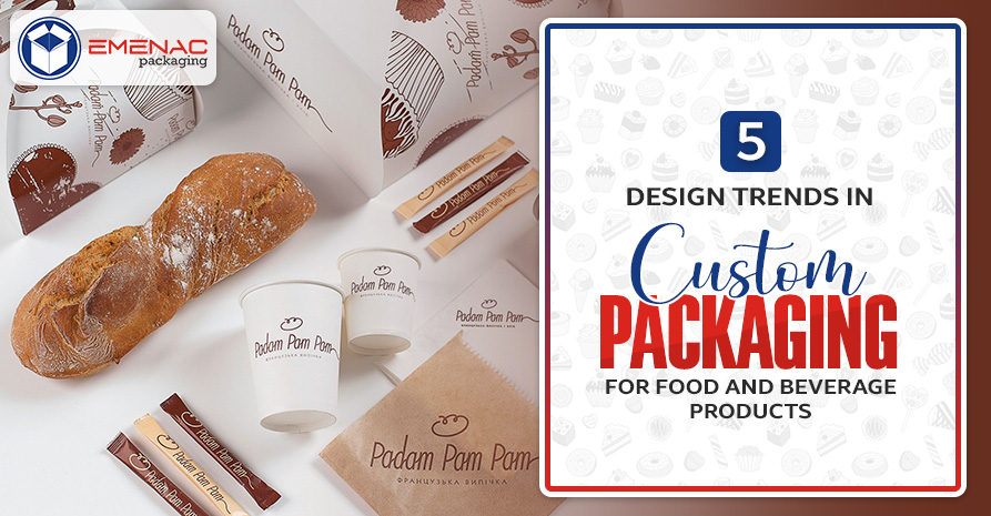
5 Design Trends in Custom Packaging for Food and Beverage Products

Are you looking for a way to deliver your brand values and enhance your sales more effectively and beautifully? You can follow new design trends as according to research published at Springer says that packaging design influences the customers’ decision about purchase. Design is an incredible way to interact with your customers by using vibrant colour schemes, stylish fonts, and trendy materials for your food & beverage products.
Let’s explore further the latest design trends in custom packaging for food and beverage products that will help you to create a strong point of difference for your brand.
1. Incorporate Brand Story
Storytelling through your design provides you an opportunity to build an insight that creates a strong emotional connection with your customer by stimulating the feeling of empathy in them. The effective way to tell the story is character development where brands try to describe their actual identity and reason for serving people through text or artworks.
2. Black & White On Kraft Boxes
When you collect demographic data about your customers and extract some insights, you will determine that customers are more concerned about the looming climate crisis. You can use Kraft boxes with simple white and black design elements to address the issue and make your packaging sustainable. As Kraft is a biodegradable material that does not injurious to the environment at all.
3. Use Creative Fonts
Fonts and text are significant communication means that help to deliver your message to your customers. When you’re creating a packaging design with creative fonts, you need to make sure to take into account the parameter of readability, brand message, and overall aesthetic value.
4. Simplistic Design
In the case of simplistic design, you create packaging for your food and beverage that is clear and intuitive. These designs assist the customers to figures out the purpose of your product easily without being overpowered by the plethora of graphics and artwork. Additionally, simplistic designs are also cost effective and helpful in extending your profitability because of using minimum colors and simple artwork.
5. Fusion of New & Old
Vintage designs used to be more detailed in the 1960’s so you can use the same calligraphy, foiling, and letterpress in your new packaging design of food and beverage. Brands use Kraft boxes to create such designs to evoke a nostalgic feeling in their customers.
Conclusion
With the arrival of new technology in the packaging industry, the boundaries to print more creative designs for food and beverage packaging are extended. Brands get benefit from these innovations and present their story in an interactive way to engage the customers. You can also use creative fonts, or simplistic design to differentiate your product from the competitors.
Share This


