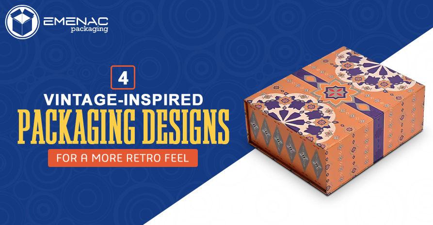
4 Vintage-Inspired Packaging Designs for a More Retro Feel

Vintage designs are back in trends and not just in the fashion industry, but in many other industries as well. Vintage packaging designs captures the charm and fascination of some of the greatest bygone eras in design, providing an emotional journey through time.
For businesses, the purpose of investing in carefully considered, expertly designed packaging is not just to enhance visual appeal but also to leave a lasting impression on customers. Customers are likely to remember a brand more if they had a great unboxing experience.
Vintage-inspired packaging enhances the customer unboxing experience. In this blog post, we’ll be discussing 4 vintage packaging designs which can give your packaging a more retro feel.
What Is a Retro and Vintage Packaging Design?
Packaging design that is considered retro or vintage draws inspiration from earlier eras, usually from the early 1900s to the 1980s. Retro design is defined as having been created with a vintage aesthetic in mind, while vintage design typically relates to a design’s age.
Retro design can refer to anything from an updated version of a vintage design to a modern design that was influenced by elements of an earlier design style. Bold typography, hand-drawn graphics, subdued colour schemes, and textures that look like aged paper or materials. These are a common component of these designs.
The intention is to evoke feelings of nostalgia and recollections of the past while giving contemporary products a unique and unforgettable appearance. This type of packaging designs not only looks appealing to the old generation, but the younger ones also appreciate its timeless charm.
4 Vintage-Inspired Packaging Designs for A More Retro Feel
1. Fonts Selection
In the 1990s, calligraphy gained a lot of popularity and was frequently used in vintage designs. Your package may truly stand out with the usage of the right fonts. Make use of traditional serif typefaces from the past, like Times New Roman, Garamond, and Baskerville. These fonts have an elegant and classic appearance. You can also use display typefaces with a vintage feel, such as Futura, Bebas Neue, or any other font with a retro vibe, for headings or brand names.
2. Vivid Images on Packaging
Consider using humorous pictures instead of a lot of text on your boxes if that’s more your style! Hand-drawn graphics were frequently printed onto packaging to grab the attention of the buyers. Think outside the box when designing the illustration, you want for your packaging.
These innovative and imaginative designs are drawing clients and igniting a sense of nostalgia in their hearts, despite being a return to the old era. Brands and their audience might become more intimate as a result.
Don’t use contemporary images; instead, use hand-drawn or antique artwork. These might be vintage ads, floral prints, or traditional cartoon styles. You can also add texture which gives the packaging an antique feel and also to diminishes the effects which can come from scratches.
3. Colour Combination (Vintage-inspired)
The appropriate colour schemes can help customers recall your brand more easily in addition to adding uniqueness to your packaging. Neons and other vivid, striking hues were not recommended. Rather, businesses can choose colors that were nearly muted and more solemn. Here are some things top consider when going for colour combination;
- Muted Tones: Make use of a palette that includes dusty pink, olive green, beige, cream, and mustard yellow. These hues create feelings of nostalgia and aging.
- Monochrome: Take into consideration the duotone or monochrome print schemes that were popular in previous print technologies.
- Contrast Combination: High contrast are also a popular combination when it comes to retro packaging. Business owner can go for different colour combination such as white with red, navy and cream or black with gold.
A retro color scheme can work wonders for your business. This cannot be argued that after printing, these colours would not look fantastic. These combinations will change the packaging overall look and will give the vibes of a vintage.
4. Bold Typography
Make sure the primary headlines and brand names you use are displayed in a bold, striking font. Businesses should play with different fonts to find the perfect one. Effective fonts include Cooper Black, Impact, and Rockwell. Apply effects that replicate letterpress printing to give the text a somewhat flawed, debossed appearance.
Why Packaging Designs Are So Important for Business Owner?
The greatest packaging designs give customers a preview of what to expect from your product. They draw attention and persuade customers to buy from them. When a packaging is designed with careful considerations, you’ll give the impression that your product is of high quality.
When it comes to your product’s purchase power, aesthetics plays an important role. Packaging design is vital, when it comes to drawing in customers, promoting your brand, and swaying their decisions to buy.
Final Thoughts
Unique and emotionally appealing packaging will become even more important as the market develops, and it will be a crucial component of any effective marketing plan. Appealing packaging can operate as a silent salesman, grabbing the interest of customers and luring them to the product’s details. Additionally, it can improve the unwrapping experience—a crucial aspect in the era of social media and unboxing videos. The above 4 vintage-inspired packaging design will definitely make your boxes unique from others and give your customers a cherished experience. Packaging designs with a sign to the past are a sweet and practical method to make a product that people will remember and find appealing.
Share This


